MatchAnalyzr is in beta - lock in your early bird discount for good, today.

View pricing

Knowledge Base

What is xPTS (Expected Points)?

The official league table shows who collected the most points. xPTS shows who deserved them. These two tables are often very different - and that difference is where the best predictions hide.

The Problem With League Tables

Glance at a Premier League table in November and you'll see a team sitting fourth. They look solid. Respectable result streak, tidy goal difference, coaches being linked to bigger clubs. But look at their xG numbers and something strange emerges: they've been outshot, out-chanced, and outplayed in most of their matches. They're just running very, very hot on finishing. This is the core problem that xPTS (Expected Points) was designed to solve. Actual league points are a product of two things: the quality of football a team plays, and the randomness that decides which of those moments become goals and which hit the post. xPTS tries to strip out the randomness and show you the quality underneath. Where xG tells you how good your chances were in a single match, xPTS translates that quality into a league-matchday-standings metric - the number of points a team would be expected to accumulate if finishing and goalkeeping luck evened out over time. It's the table behind the table, and for serious football analysis, it's often more revealing than the official one.

How xPTS is Calculated

The mechanics of xPTS start with a concept called Monte Carlo simulation - which sounds intimidating but is actually a beautifully intuitive idea.

The 10,000 Matches Thought Experiment

Imagine taking a single match - say, Arsenal vs. Chelsea - and replaying it not once, but 10,000 times. Every time you replay it, the chances created are identical: the same xG values for each shot. But the actual outcomes vary randomly according to those probabilities. In some runs, Arsenal score their 0.31 xG chance. In others, they don't. The goalkeeper makes the save. The ball clips the crossbar. The striker miscues. After 10,000 simulations, you can calculate: in what percentage of replays did Arsenal win? Draw? Lose? Multiply those percentages by 3 (win), 1 (draw), and 0 (loss) respectively, and you get Arsenal's expected points from that match. A team that created 2.1 xG against a team that created 0.6 xG doesn't win every simulation - the underdog wins some, and draws happen frequently. But the match-level probability skews heavily toward the better-chance-creating team. That expected points figure (say, 2.1 out of 3) is Arsenal's xPTS contribution from that match. Add up all the xPTS contributions across a season's worth of matches, and you have a team's seasonal xPTS - their 'deserved' points tally.

From xG to Match Probability

The calculation uses each team's individual xG values per shot rather than their aggregate totals, because the order and distribution of chances matters. Two teams can both generate 1.5 xG in a match via very different patterns - one through six medium-quality shots, one through a single high-quality penalty and four speculative efforts. The simulation treats each shot independently, which captures this nuance. Modern xPTS models often also account for: whether the goals actually scored match the simulation (since actual goals influence the game state and therefore subsequent chance-creation), the timing of goals within the match, and red cards. The simplest models ignore these complications and still produce remarkably useful output.

MatchAnalyzr Tip

Open the xG Table widget on your dashboard to see live xPTS standings for any league. Each team shows their actual points vs. xPTS, with colour-coded indicators for over- and underperformance. Filter by the last 10 games to see current form rather than full-season averages.

Over- and Underperformers: The Luck Index

The most immediately useful application of xPTS is simple arithmetic: subtract a team's xPTS from their actual points, and you get a 'luck index' - a measure of how much fortune has helped or hurt their season so far. **Points − xPTS = Luck Index** A positive number means a team is collecting more points than their underlying performance suggests they deserve. They're overperforming. A negative number means they're underperforming - playing better than their results indicate. Here's what a mid-season xPTS table might look like:

Reading an Example xPTS Table

| Team | Actual PTS | xPTS | Difference | |---|---|---|---| | City United | 38 | 36.2 | +1.8 | | Riverside FC | 35 | 39.1 | −4.1 | | Northgate Athletic | 32 | 28.7 | +3.3 | | County Town | 29 | 31.4 | −2.4 | | West Harbour | 26 | 23.8 | +2.2 | | Millford City | 24 | 27.6 | −3.6 | In this hypothetical table, City United's dominance at the top looks real - their xPTS confirms it. But Northgate Athletic at third are collecting 3.3 more points than deserved; they're overachieving and are a regression candidate. Riverside FC at second are actually the best-performing team by underlying quality - they sit second but deserve to be first by xPTS. Millford City look like they've been extremely unlucky. This information changes how you should interpret each team's actual table position.

Why Overperformers Tend to Regress

This is the crucial insight that xPTS provides. When a team's points total substantially exceeds their xPTS, something unsustainable is happening. Either they have an elite goalkeeper making world-class saves on a consistent basis, or their strikers are finishing way above their expected rate, or both. The mathematics of probability say these extremes don't persist forever. A striker finishing at 150% of his xG rate for an entire season will, over time, come back toward the mean. A goalkeeper saving shots at a rate 15% above expected will have a worse run. Chance creation and chance prevention tend to be more stable than finishing rates - so when there's a large gap between xPTS and actual points, expect reversion. The classic case study is Leicester City's 2015/16 Premier League title-winning season. Their xPTS that year was around 65-68 points, yet they actually collected 81. The gap - around 13-16 points - was largely attributed to Riyad Mahrez and Jamie Vardy finishing at extraordinary rates, and Kasper Schmeichel making key saves in tight moments. The football was excellent, the organisation was superb, but the finishing luck was also remarkable. Leicester's title was earned - but it was also somewhat fortified by fortune. The following season, much of that fortune evaporated and they finished 12th.

Famous Examples of xPTS Divergence

History is littered with cases where xPTS and actual points told very different stories.

Brighton: The Perennial Underperformer

Brighton under Graham Potter and then Roberto De Zerbi became the canonical example of a team whose xPTS chronically exceeded their actual points. Season after season, they created high-quality chances, conceded relatively few, and yet their points tally never quite matched the underlying output. Part of the explanation was striker finishing efficiency - the wrong players in the wrong positions at times - but the xPTS told sophisticated observers that Brighton were better than their league position suggested. This made Brighton a reliable 'sell high on the actual table, buy on xPTS' team. Analysts who trusted the xPTS over the raw table knew Brighton wouldn't be in a relegation battle. They were right, repeatedly.

Crystal Palace: Running Hot Under Hodgson

At the other extreme, teams occasionally produce defensive, counter-attacking football that generates few clear chances but wins matches on individual brilliance. Crystal Palace in some Hodgson seasons would sit comfortably mid-table on actual points while their xPTS suggested a much tighter fight near the bottom. The table flattered them. When the tight defending slipped or the counter-attacking precision faded, the underlying reality asserted itself.

The Regression Trap

One of the most common mistakes in football punditry is projecting early-season form forward without accounting for xPTS. A team that wins their first seven matches but has an xPTS of 10 from those games (meaning they 'deserved' to win roughly three or four of them based on chance quality) is unlikely to maintain that record. The pundits writing articles about 'this team's title challenge' based on seven actual wins are sometimes ignoring a ticking regression clock that the xPTS makes visible.

xPTS as a Season Prediction Tool

Perhaps the most practically useful application of xPTS is as a forecasting instrument for the remainder of a season.

The Simple Rule: Expect Reversion

The core predictive principle is straightforward: teams currently overperforming their xPTS are more likely to drop points over the coming weeks than their current form suggests. Teams underperforming their xPTS are more likely to improve. This isn't a guarantee - it's a probability statement. A team 5 points above their xPTS might maintain their overperformance if they genuinely have exceptional finishing quality. But on average across the league, over time, xPTS gaps close. Teams above their xPTS tend to come down. Teams below tend to rise. At the most basic level: if you're trying to predict the final league standings in February, a weighted combination of actual points and xPTS will outperform either metric alone.

Identifying Sleeper Teams

The most valuable application is spotting teams that are underperforming their xPTS early in the season - before the broader market has noticed. A team sitting 12th but with an xPTS that says they deserve to be 7th or 8th has probably had a run of tight losses, missed penalties, or saved shots that don't reflect the underlying performance level. Managers of these teams often describe their situation accurately: 'We're playing well, the results aren't reflecting it.' The xPTS confirms this intuition with data. These are teams whose run is likely to improve, whose manager is unlikely to be sacked, and whose players are unlikely to be shipped out in panic buying. They're the sleepers - teams trading at a discount on the actual table who look much better on the xPTS table.

Building Robust Analysis: Combining xPTS With Form

xPTS is most powerful when combined with actual recent form rather than used in isolation. A team underperforming their seasonal xPTS but showing signs of genuine decline - dropping pressing intensity, losing key players, managerial unrest - may not bounce back. The xPTS gap might be real, but the improvement might not come. Conversely, a team that has strong xPTS numbers AND improving actual results is a compelling case. They've been performing well on the underlying metrics, and the results are starting to follow. This combination - xPTS as foundation, actual form as confirmation - gives you the most robust analytical picture. A complete team analysis should include: - Current actual points vs. xPTS (overperformance or underperformance?) - Trend: is the xPTS gap widening or narrowing? - Underlying xG quality: is chance creation improving or declining? - Squad context: are the key contributors healthy and available?

MatchAnalyzr Tip

Use the Team Stats widget to drill into a specific team's xG per match trend over the season. A team with consistently high xG but a points total below their xPTS is a strong regression candidate - and potentially a great team to back for improvement in the second half of the season.

The Alternative League Table: What xPTS Reveals

If you rank every team in the league by xPTS rather than actual points, you get a strikingly different picture. In some seasons, the alternative table is almost identical to the real one - suggesting the results closely reflect underlying quality. In other seasons, there are dramatic differences. A team sitting 4th on actual points but 9th on xPTS is a team that's gotten a bit lucky. That should temper enthusiasm. A team sitting 10th on actual points but 5th on xPTS is a team whose quality hasn't yet been rewarded. That should generate optimism. Over an entire season, the actual table and xPTS table converge significantly - because 38 matches is a large enough sample for some reversion to occur. But over half a season (or during the crucial winter months when betting markets, transfer decisions, and managerial appointments are most active), the gap between the two tables can be enormous and enormously informative.

Limitations of xPTS

Like all models, xPTS is useful but imperfect. Understanding its limitations helps you apply it correctly.

It Assumes Average Finishing

The biggest assumption baked into xPTS is that all strikers and goalkeepers perform at average rates. But some strikers genuinely are above-average finishers - consistently outperforming their xG not through luck but through skill. Erling Haaland has outperformed his xG at every club he's played for. At Dortmund, it looked like luck. Three seasons later, it looks like skill. For teams with elite finishers, xPTS will systematically underestimate actual points. For teams with below-average finishing squads, xPTS will systematically overestimate. This is a significant caveat that analysts should keep in mind. A more sophisticated approach - using each player's historical finishing rate rather than the league average - partially addresses this, but introduces new uncertainties. The basic model is still valuable even with this limitation.

Sample Size Still Matters

After five or six matches, even xPTS numbers are highly variable. The model needs a larger sample - probably 10+ matches - before the signal starts to outweigh the noise. Early-season xPTS tables are indicative but should be held lightly. By matchday 20-25, they're much more reliable guides to where teams actually sit in the quality distribution.

Game State Effects

xPTS models that simply sum xG across a match can miss an important dynamic: game state changes chance creation. A team chasing the game with 20 minutes left takes more risks, creates higher-xG chances, and also concedes more dangerous counters. A team protecting a lead parks the bus and accepts low xG. These effects can distort the underlying picture. The best xPTS models adjust for this - comparing chance quality to what you'd expect from teams at that scoreline, not to a universal baseline. Simpler models don't make this adjustment, which is why xPTS figures can vary between different data providers.

MatchAnalyzr Tip

The Season Comparison feature lets you view a team's xPTS vs. actual points across multiple seasons. Teams that chronically underperform their xPTS often have structural finishing issues - while teams that chronically overperform often rely on individual brilliance that's hard to sustain.

Frequently Asked Questions

What is xPTS in football?
xPTS (Expected Points) is a metric that calculates how many league points a team 'deserves' based on the quality of chances they created and conceded in each match, using Monte Carlo simulation derived from xG values. It strips away finishing and goalkeeping luck to reveal underlying performance quality.
How is xPTS different from actual points?
Actual points reflect what happened: who scored, who won. xPTS reflects what should have happened on average, based on the quality of chances each team created and allowed. A team can have 12 actual points but 8 xPTS (getting lucky) or 8 actual points but 12 xPTS (getting unlucky). The gap between the two is the 'luck index'.
Can a team sustainably outperform their xPTS?
Yes, but only if they have genuinely elite finishing or goalkeeping talent. Teams with world-class strikers who consistently outperform their xG (like Haaland or Kane) will naturally collect more points than a naive xPTS model suggests. For average squads, large sustained gaps between actual points and xPTS are almost always partially luck-driven and subject to reversion.
How many matches do I need before xPTS is reliable?
As a rough guide, xPTS becomes meaningfully informative after 10-12 matches and increasingly reliable through matchdays 15-25. In the first 5-6 games, both xG and xPTS are subject to significant variance. By the midpoint of the season, the signal is strong enough to make confident judgements about over- and underperformers.
Which teams most often diverge from their xPTS?
Teams with exceptional individual talent (elite finishers or outstanding goalkeepers) most often diverge sustainably from their xPTS. Counter-attacking teams that defend deep and win on set pieces or transitions also frequently outperform their xPTS, because they create fewer but higher-quality chances than the average - which some basic xPTS models handle imperfectly. Brighton, historically, have been a famous example of chronic xPTS underperformance: their xPTS consistently exceeded their actual points total, meaning they repeatedly played better than their results rewarded them.
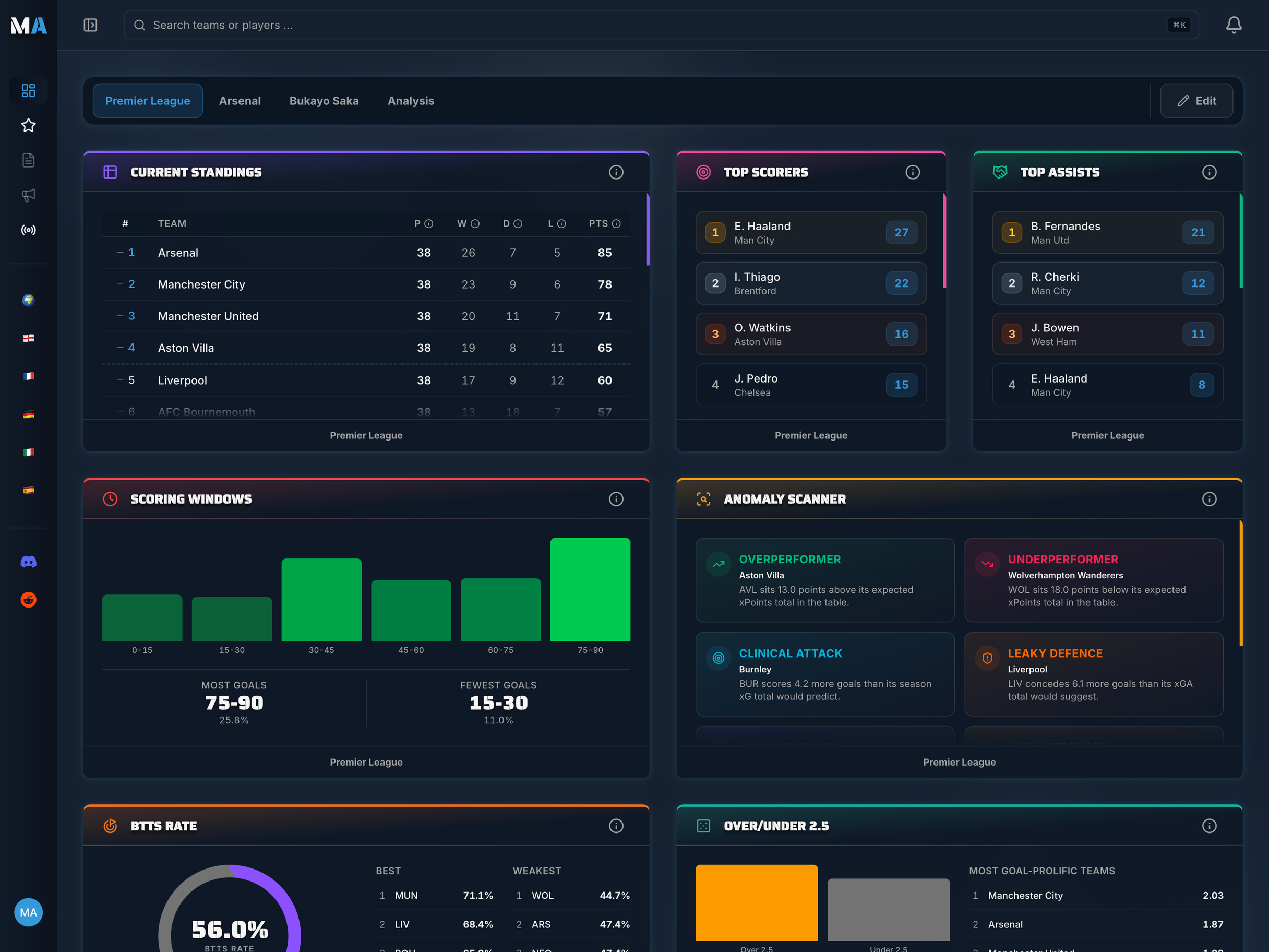
Your football. Your analysis data. Your dashboards.

Turn raw data into real insights with MatchAnalyzr. Build your own personalised football dashboard with the leagues, teams and players you actually follow.

MatchAnalyzr app screenshot