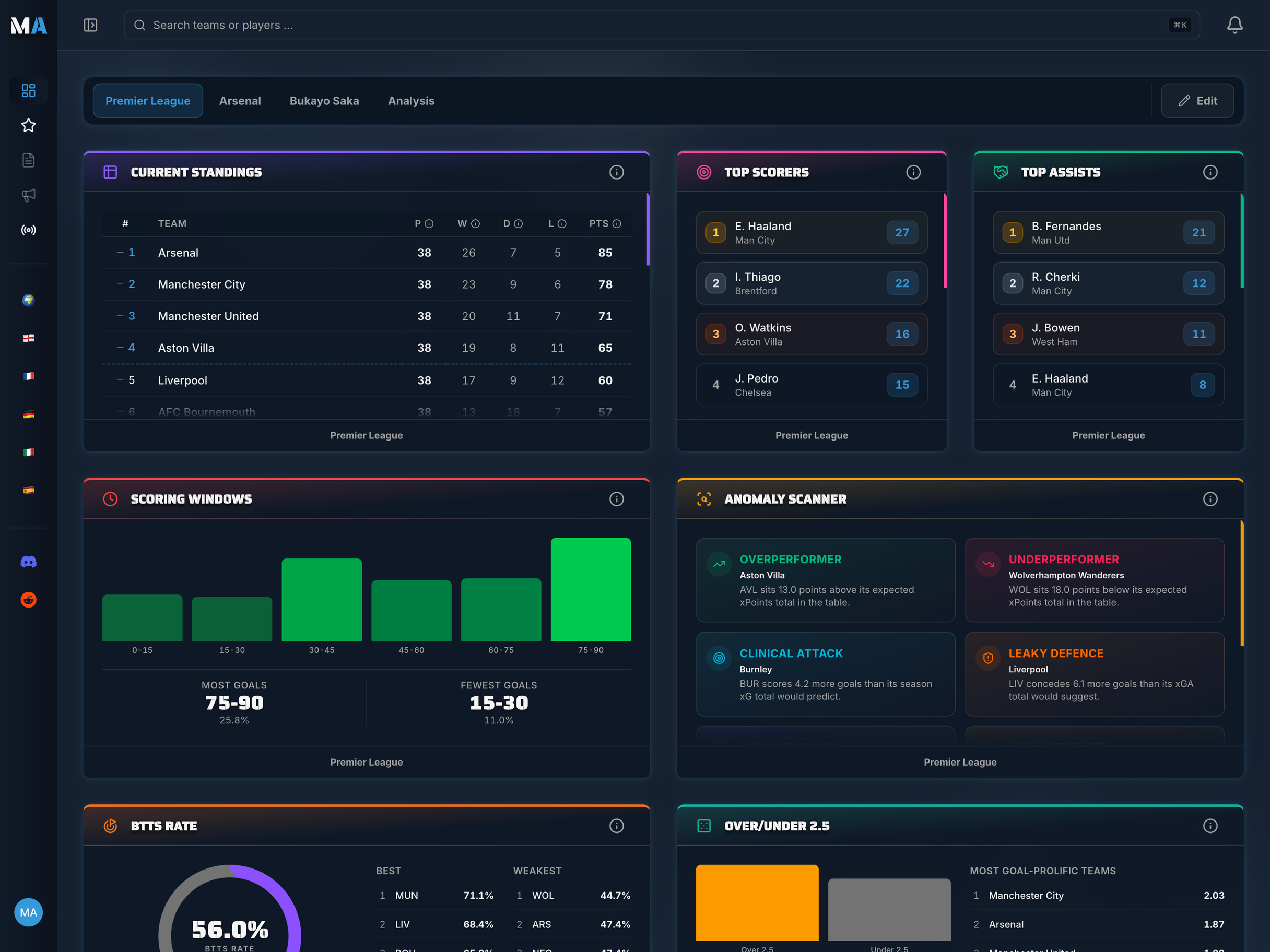
Season Comparison: Analyzing Teams Across Multiple Seasons
One season tells you what happened. Several seasons tell you why - and what comes next. Multi-year analysis is where football data moves from description to prediction.
What Single-Season Stats Cannot Tell You
Every summer, the narrative factories go into overdrive. A mid-table club finishes sixth, and pundits declare a revolution. A top-four regular drops to eighth, and the manager is branded a failure. Transfer fees cascade in. Patience evaporates.
Most of this reaction is based on single-season snapshots - and single seasons are riddled with noise. A goalkeeper who has a career year. An injury to the opposition's key player. Fixtures that happen to fall favourably in a congested run. A penalty awarded, or denied, in three consecutive matches that each finish 1-0.
None of these factors tell you anything reliable about a club's structural quality. But when you stack multiple seasons side by side, the noise starts to cancel out. What remains is signal: genuine improvement, genuine decline, genuine stagnation. The patterns that survive across three, five, or ten seasons are the ones worth betting your analysis on.
This is the central premise of season-over-season comparison: not to obsess over a single data point, but to find the trajectory. And trajectory, in football as in almost everything, is far more predictive than position.
The Difference Between a Blip and a Trend
Consider two teams. Team A scores 58 points one season, 54 the next, 61 the year after. Team B scores 58, then 52, then 47. In isolation, both teams' most recent season looks similar - moderate mid-table performance. But in context, Team A is volatile and roughly stable; Team B is in measurable, consistent decline.
Single-season analysis cannot distinguish these two clubs. Multi-season analysis does so immediately. The direction of travel matters more than any individual destination. And once you can see direction clearly, you can start asking the right questions about cause.
Which Metrics Work Best for Cross-Season Comparison
Not all statistics are created equal when it comes to multi-season analysis. Some metrics are highly stable across seasons - they change slowly, and when they do change, it's meaningful. Others are volatile and noisy, prone to large swings that tell you nothing about underlying quality.
The general principle: **rate metrics beat volume metrics, and process metrics beat outcome metrics** when comparing across seasons.
Rate Metrics vs Volume Metrics
Volume metrics - total goals scored, total shots, total clean sheets - are contaminated by the number of games played. Leagues expand, cups add fixtures, European campaigns vary in length. A team scoring 68 goals one season and 61 the next hasn't necessarily declined; they may simply have played fewer matches.
Rate metrics solve this cleanly. Goals per game, shots on target per 90 minutes, clean sheet percentage - these are comparable across seasons regardless of match count. They're also comparable across different eras, different squads, and even different leagues once you account for contextual differences.
**For season comparison, always convert volume to rate:** points per game instead of total points, xG per 90 instead of seasonal xG total, pass completion percentage instead of total passes. The rate tells you quality; volume tells you quantity. Quality generalises; quantity doesn't.
Process Metrics vs Outcome Metrics
Outcome metrics (actual goals, actual points, actual wins) capture what happened. Process metrics (xG, xGA, shot volume, pressing intensity) capture how it happened - the quality of the football being played underneath the scorelines.
For multi-season comparison, process metrics are dramatically more informative because they're less contaminated by luck. A team that scores 72 goals may have been extremely clinical, or they may have generated 85 xG and simply converted well above expectation. Only the xG figure tells you which it was.
The most stable and predictive metrics for season-over-season comparison are:
- **xG per 90** (attacking quality)
- **xGA per 90** (defensive quality)
- **Points per game** (outcome, but rate-normalised)
- **xPTS per game** (deserved points, noise-reduced)
- **Clean sheet percentage** (defensive organisation)
- **Press success rate** (tactical intensity)
- **Deep progressions per 90** (ball progression quality)
Metrics to Treat With Caution
Goal conversion rate (actual goals ÷ shots) oscillates wildly across seasons for most teams because it's heavily influenced by finishing luck, goalkeeper form, and the quality of individual strikers. A team posting a 14% conversion rate one season and 11% the next hasn't necessarily gotten worse at attacking football - they may simply be finishing closer to their expected level.
Similarly, penalties scored, set-piece conversion rates, and long-shot goals are high-variance events. Over a single season, they can massively distort attacking output figures. Multi-season analysis should either isolate these events or use non-penalty xG metrics that smooth them out.
MatchAnalyzr: Season Switcher
The Season Switcher in MatchAnalyzr lets you load historical data across multiple seasons directly in your dashboard. Free plan covers the current season. Pro unlocks the last 3 seasons. Premium users access up to 10 seasons of historical data - enough to trace the full arc of any club's transformation.
Accounting for Context: Why Raw Numbers Don't Tell the Full Story
Season comparison would be straightforward if everything stayed constant between years. Squads don't change. Managers don't leave. Leagues don't restructure. Transfer budgets remain fixed.
Of course, none of that is true. Interpreting multi-season trends requires accounting for the factors that make this season's context genuinely different from last season's.
Squad Investment and Net Spend
A team that improves their xG per 90 from 1.41 to 1.68 might be playing better football - or they might have spent £80m on a world-class striker. Both stories end in the same number, but they have very different implications for sustainability and future performance.
Contextualising season comparisons against transfer activity is essential. Net spend figures (money spent minus money received) are publicly available for most top leagues and provide crucial context for interpreting performance changes. A team showing sharp improvement after heavy investment has simply bought their way to better numbers; a team showing the same improvement on a near-zero transfer budget is executing genuine tactical and developmental progress, which is typically far more durable.
Managerial Changes and Tactical Discontinuity
Few events disrupt a team's statistical profile more violently than a managerial change. New managers bring different defensive shapes, different pressing intensities, different attacking principles. A team might shift from a high-press 4-3-3 to a low-block 5-4-1 in a single summer, producing an entirely different statistical fingerprint across almost every metric.
When comparing seasons that span a managerial change, be careful not to attribute performance trends to player development or squad quality when the real driver is tactical philosophy. The signal in the data belongs to the system, not necessarily the squad.
Conversely, a team maintaining the same manager across multiple seasons provides the cleanest multi-year comparison signal: changes in performance reflect squad evolution, fixture difficulty, or genuine team development rather than system changes.
Promotion, Relegation, and League Level Effects
The most dramatic context shift of all is a change in league level. A team promoted from the Championship to the Premier League does not simply continue their trajectory - they enter a competition of materially higher quality, where their xG per 90 will almost certainly drop, their xGA per 90 will almost certainly rise, and their clean sheet percentage will fall.
Comparing a team's Championship season directly against their Premier League season is analytically misleading without adjustment. The metrics need to be viewed relative to league average for each season - not in absolute terms. A team generating 1.65 xG per 90 in League One and 1.42 xG per 90 in the Championship may actually have improved in quality, if the league average xG per team dropped by more than 0.23 between the two seasons.
The Second Season Syndrome
Ask any football fan to name a newly promoted team that started brilliantly in their first top-flight season, then collapsed in their second, and they'll name several without thinking hard. This phenomenon - the 'second season syndrome' - is one of the most documented and least understood patterns in football.
The traditional explanation is psychological: opponents figure you out, the novelty fades, the adrenaline runs dry. The statistical explanation is more interesting: newly promoted teams often massively overperform their underlying metrics in their first top-flight season.
Promotion sides tend to have been dominant in their previous league - generating high xG, low xGA, winning routinely. That dominance produces a psychologically cohesive, tactically well-drilled unit. In the first top-flight season, the tactics are still largely intact, the organisation is strong, and the players are performing at the peak of their powers within a familiar system.
But top-flight opposition eventually decodes the approach. The manager's tactical playbook - which produced dominance in a lower division - gets pressured by better players who can exploit its limitations. By the second season, the same system produces far fewer high-quality chances, xG drops, and unless significant investment has upgraded the squad, results follow downward.
Season comparison tools reveal this trajectory with clarity: first-season xG metrics often look solid for promoted sides (sometimes better than expected), while second-season metrics tell the more authentic story of their true competitive level at the higher standard.
Dynasty Tracking: How Elite Teams Sustain or Lose Their Edge
At the opposite end of the spectrum from newly promoted sides are the elite clubs - the teams that occupy Champions League places for a decade straight. Season comparison across their multi-year arcs reveals how dominance is constructed and, eventually, how it ends.
Liverpool between 2015 and 2020 provide the definitive recent case study. In Jürgen Klopp's first full season (2016-17), Liverpool's xG per 90 sat at around 1.65 - good, but not elite. By 2018-19 - the season of 97 points and Champions League glory - it had risen to approximately 2.1, while their xGA per 90 had dropped to around 0.9. Both directions of improvement over three seasons, maintained simultaneously, is how dynasties are built.
The trajectory was visible in the data long before the trophies arrived. xG trended upward. xGA trended downward. Press success rates increased. Deep progressions increased. Any analyst tracking these metrics across the 2016-2019 window could see a title challenge forming - not as a prediction, but as an observable, data-confirmed trajectory.
Conversely, Arsenal's decline from 2016 to 2020 was equally legible in multi-season data. Their xG per 90 remained relatively stable - they were creating chances. But their defensive xGA per 90 was creeping upward season by season, pressing intensity was declining, and set-piece vulnerability was growing. The actual league positions moved slowly (8th, 5th, 8th across three seasons), obscuring the worsening defensive structure. Season comparison made the underlying deterioration visible far earlier than tabloid narratives did.
Transfer Impact Analysis: Measuring the Before and After
One of the most powerful applications of season comparison is measuring the genuine impact of significant transfer activity. The question sounds simple: did the signing of Player X actually improve the team? The answer requires more than watching highlights.
If a club signs an attacking midfielder in January, the relevant comparison is not just results before and after the window - it's xG per 90 before versus after, shot volume before versus after, chance quality distribution before versus after. If these metrics improve materially in the post-signing period relative to the pre-signing period, the data supports the transfer's value. If they don't - if only goals go up while xG stays flat - the improvement may be temporary finishing luck rather than genuine attacking enhancement.
Multi-season comparison extends this further: tracking whether a major summer signing's impact is sustained across full seasons, or whether the improvement was concentrated in an early honeymoon period and subsequently faded.
MatchAnalyzr: team-season-compare Widget
The team-season-compare widget (Premium) places current and previous season side by side in a single view: points per game, goals scored and conceded, xG and xGA, clean sheet percentage, and form trajectory. Trend arrows show the direction of change at a glance - rising, stable, or declining - without requiring manual calculation across multiple data sources.
Reading Improvement Arcs and Decline Patterns
Season comparison's most practically valuable output is identifying where a team sits on their trajectory arc: ascending, plateaued, or declining. Each pattern has distinct statistical signatures that often emerge in process metrics long before they show up in league positions.
Progressive Improvement: The Building Pattern
Teams on genuine upward trajectories typically show:
- **Rising xG per 90** across successive seasons - consistently creating higher-quality chances
- **Falling xGA per 90** - tightening defensively, pressing more effectively
- **Closing the gap between xPTS and actual points** - if a team was unlucky one season and showed improvement in underlying metrics the next, expect results to follow
- **Increasing squad depth** - evidenced by consistent performance even during injury periods
The most bullish signal is a team whose xG per 90 has risen significantly but whose actual points haven't yet caught up. This xG-to-results lag often indicates a team on the cusp of a breakout season - their underlying quality has already arrived, but finishing luck or goalkeeper variance is temporarily suppressing results.
Early Warning Signs of Decline
Declining teams typically display:
- **Rising xGA per 90** across consecutive seasons - deteriorating defensive structure or pressing intensity
- **Falling deep progressions** - opponents are winning the midfield battle more often
- **Widening xPTS-to-actual-points gap in the positive direction** - overperforming relative to underlying quality, which is unsustainable
- **Increasing variance in xG output** - losing consistency, becoming reliant on individual moments rather than systematic chance creation
This last signal is particularly insidious. A team that creates 2.1 xG per 90 in 28 of their 38 matches but creates less than 0.8 xG in the other ten is structurally vulnerable in a way that their season average disguises. Season comparison should examine variance, not just mean values.
Using Season Comparison for Predictions
All the analysis above ultimately serves one purpose: using historical patterns to make better predictions about future performance. Season comparison provides several concrete predictive frameworks.
**The xG-Results Lag:** A team that has improved their xG per 90 for two consecutive seasons but whose points per game hasn't risen proportionately is almost certainly underperforming their underlying quality. The statistical expectation is mean reversion - their results will converge toward their process metrics. Betting against this team in the short term is statistically unjustified; betting that they will improve is well-supported.
**The Overperformance Warning:** A team whose actual points per game significantly exceeds their xPTS per game for the second consecutive season is not building a dynasty - they're benefiting from sustained luck, which always ends. This overperformance warning, visible in multi-season xPTS comparison, is one of the most reliable regression signals in football analysis.
**The Defensive Renovation Signal:** A team that installs a new defensive system and shows falling xGA per 90 in the first season will, if that system is sustained, typically see further improvement in year two as players internalise the structure. Early defensive improvement signals tend to compound.
**The Tactical Ceiling:** If a team's xG per 90 has been stable (not rising) across three or more seasons despite heavy investment, they may have reached a tactical ceiling - the current system extracts maximum value from typical squad quality in that range. Only a step-change tactical shift or truly elite individual additions will push them beyond this plateau.
MatchAnalyzr: Historical Data
Historical season data in MatchAnalyzr is sourced from our data provider, covering top European leagues with full xG, xGA, and advanced metrics across multiple seasons. This means your season comparisons aren't limited to surface stats - you can track the process metrics that actually predict future performance, not just the outcomes that describe the past.
Cross-League Comparisons: Limitations and Adjustments
Comparing a team's performance across different leagues - whether due to promotion, relegation, or (in the case of international club analysis) monitoring teams in different European divisions - introduces significant analytical challenges.
Leagues vary dramatically in their average xG per game, pressing intensity, pace, and defensive organisation. The Bundesliga produces more open, higher-xG matches than Serie A. The Premier League's athleticism creates different pressing dynamics than Ligue 1. A raw xG per 90 comparison between a team's Bundesliga season and their subsequent Premier League campaign tells you almost nothing without adjustment.
The most rigorous approach is to normalise all metrics to league average for each season. Express a team's xG not as an absolute number but as a ratio to league mean: a team at 1.3× the league average xG is performing equivalently whether that absolute figure is 1.4 xG per 90 in the Bundesliga or 1.2 xG per 90 in Serie A.
This relative-position approach also solves the inflation problem that makes decade-spanning comparisons challenging. Football has become progressively more data-aware, more tactically sophisticated, and (for elite clubs) more heavily invested. A Premier League team's xG per 90 in 2015 is not directly comparable to a team's figure in 2024 without adjusting for the league-wide changes in playing style over that period.
Frequently Asked Questions
How many seasons do I need to identify a genuine trend?
Two seasons can indicate a direction; three seasons establish a trend with confidence. A single data point is a snapshot. Two points define a line, but that line might be coincidental. Three consecutive seasons moving in the same direction on stable metrics like xG per 90 or xGA per 90 is strong evidence of a genuine structural change in a team's quality - not noise.
Can season comparison work for lower-league teams with less data?
Yes, but with caveats. Lower leagues typically have less granular tracking data - xG models are less reliable where shot location data is collected less precisely, and metrics like pressing intensity may not be available at all. Focus on the metrics that are available and reliable: points per game, goals per game, goal difference per game. These are sufficient to identify clear trajectories even without advanced data.
What does it mean when a team's xG improves but their actual goals don't?
It means their underlying attacking quality has risen but their finishing efficiency has fallen, or their goalkeeper is underperforming. The xG improvement is the more durable signal - it reflects the quality of chances being created, which is shaped by tactics and squad quality. Actual goals per game is noisier and more volatile. If xG has risen for two seasons running, expect actual goals to follow unless there's a specific, identifiable reason for persistently poor finishing.
How should I handle season comparisons when a team's manager changed mid-season?
Split the season into pre- and post-change windows and treat each as a separate data point. A mid-season managerial change effectively produces two half-seasons under different systems. Comparing the whole season to the previous one compounds the data from two managers with very different approaches, which obscures both the failure that led to the sacking and the impact of the replacement. Most serious analysts treat full seasons under a consistent manager as the cleanest comparison unit.
Is the 'second season syndrome' real or a myth?
It's real, but it's not universal. The phenomenon is most pronounced for newly promoted teams who were tactically dominant in a lower division - their system gets decoded, and without the budget to upgrade the squad, results deteriorate. For teams that combined promotion with significant investment and squad restructuring, second seasons often show improvement rather than decline. The syndrome is a tendency, not a law. Season comparison tools let you distinguish which pattern applies to each specific case.
Your football.
Your analysis data.
Your dashboards.
Turn raw data into real insights with MatchAnalyzr. Build your own personalised football dashboard with the leagues, teams and players you actually follow.