Shot Maps Explained: Visual Analysis of Shots on Goal
A single image that shows where every shot was taken, how dangerous it was, and what happened - shot maps turn raw data into tactical intelligence.
What Is a Shot Map?
Open any match report from a serious analytics outlet and you'll find it: a bird's-eye view of a football pitch, dotted with circles of varying sizes and colours scattered across the attacking half. This is a shot map - and once you know how to read one, you'll never look at a match the same way again.
A shot map is a spatial visualisation of every shot attempt in a match, a series of matches, or an entire season. Each shot is plotted at the exact position on the pitch where it was taken. That's the foundation. But the real power of a shot map lies in what each marker encodes beyond mere location: the size of the dot represents how dangerous the chance was (expressed as an xG value), and the colour tells you what happened - did the ball end up in the net, was it saved, did it hit a defender, or sail harmlessly over the bar?
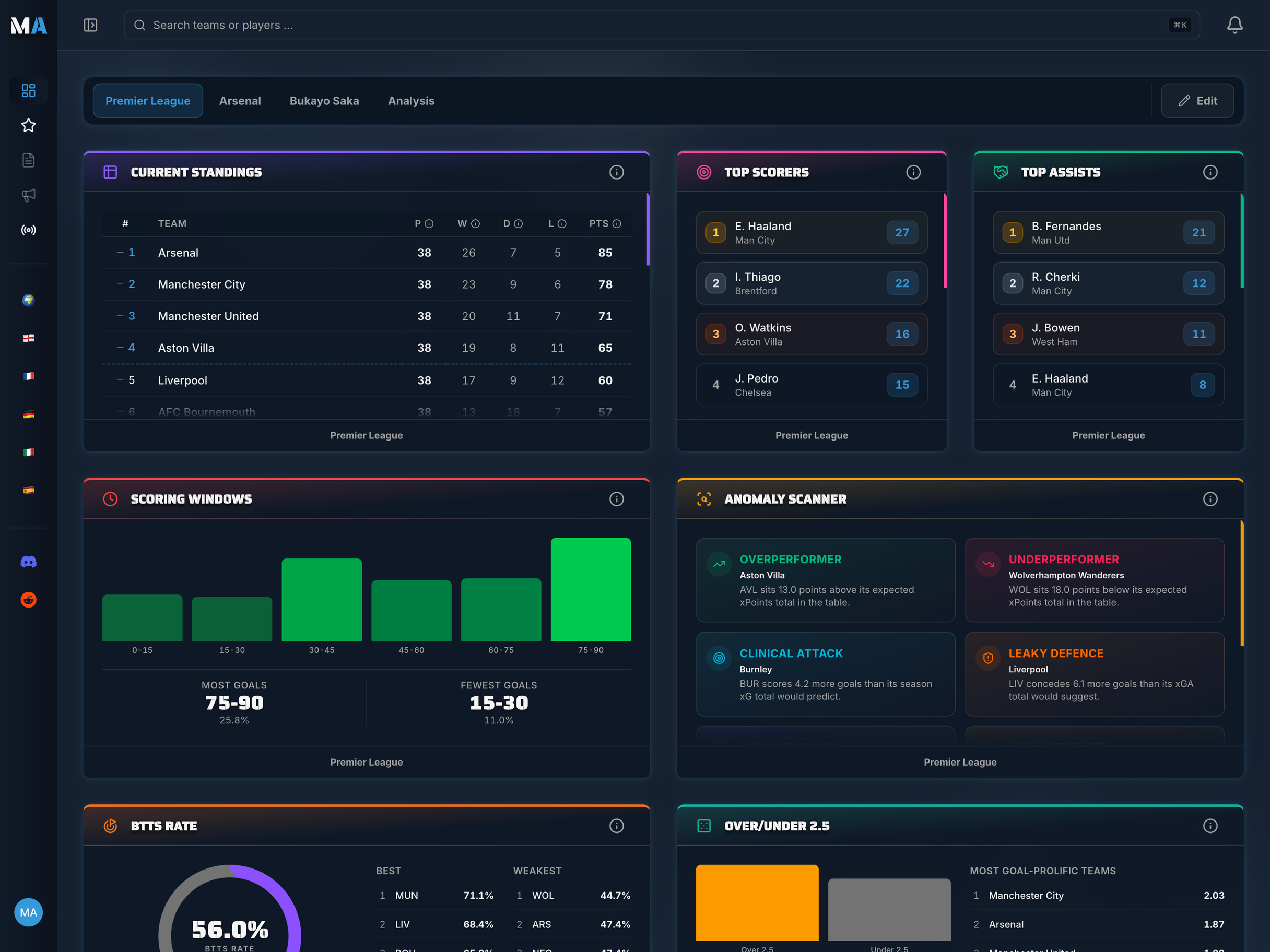
MatchAnalyzr takes a pragmatic approach: rather than plotting each shot's exact pitch coordinates, the `team.shot-profile` widget focuses on the statistical essence of a shot map - shot quality. You see the inside/outside-box distribution, the xG breakdown by origin (open play, set plays, corners, penalties), the count of big chances created and missed, and the bad-luck factor (woodwork hits). The widget answers a shot map's most important question - „how good are my team's chances?" - in a compact KPI view that works on a smartphone.
What makes this view so valuable: it translates table numbers into a story. An xG table tells you a team generated 1.8 xG. The shot profile tells you how those 1.8 xG were composed - three set-piece chances or a long stretch of low-xG long-range efforts - and gives you the tactical context a flat table never could.
MatchAnalyzr Tip
The `team.shot-profile` widget condenses the shot-map idea into a compact statistical view: an inside/outside-box donut, an xG breakdown by origin (open play / set plays / corners / penalties) as a stacked bar, and big-chance conversion as a KPI. Instead of plotting individual dots on a pitch, the widget shows shot quality in aggregate - which answers the tactical questions faster and works on small screens.
How to Read Every Element of a Shot Map
Before analysing tactics, it's worth mastering the grammar of shot maps. Each element carries precise meaning.
Position: Where the Shot Was Taken
The most fundamental piece of information is the shot's location on the pitch. The centre of the penalty area - roughly six to twelve yards from goal - is the most dangerous zone in football. Shots from here are taken with maximum time, space, and proximity to goal. They appear frequently on the shot maps of clinical attacking teams.
Wide positions produce shots under greater angle pressure. A shot from the corner of the six-yard box is geometrically limited: even if the striker connects perfectly, the area of goal they can hit is a fraction of what's available from a central position. This spatial reality is why central chances score so much more often - and why a shot map full of wide attempts, despite high volume, can actually reveal a team struggling to create quality.
Long-range attempts from outside the eighteen-yard box often pepper the lower portions of a shot map. They look impressive in isolation - fierce strikes from distance - but their xG values are typically 0.03 to 0.08. They tell a story too, just not always a flattering one: a team taking many long shots may be struggling to find a way through a compact defensive block.
Size: The xG Value
The diameter of each circle on a shot map encodes the value of that attempt. A tiny speck near the corner of the penalty area represents a speculative effort - maybe 0.03 or 0.04 xG. A large, prominent circle six yards out in the centre of the box might carry 0.45 or 0.60 xG. The biggest circles of all - penalties, tap-ins, shots at an empty net - sit at 0.76 to 0.95 xG.
Reading the size distribution across a shot map gives you an instant quality audit. If a team's attacking shot map is dominated by small dots, they're creating volume without quality - shooting often, but from poor positions. If it contains several large circles, they're generating high-value chances regardless of whether those chances were converted.
This distinction matters enormously for evaluating teams over time. Chance quality, not just quantity, predicts future performance far more accurately than goals scored alone.
Colour: The Outcome
The colour coding on a shot map is perhaps its most emotionally resonant layer. Green dots - goals - jump out immediately. In a typical season shot map, you might see twenty or thirty green markers scattered across thousands of total attempts. Each one represents a moment the net rippled.
Yellow markers - saved shots - cluster around the high-xG zones near goal, because that's where most quality chances occur and where goalkeepers are most tested. Red markers - blocked shots - often appear at the edges of the penalty area and in shooting lanes from distance, where outfield defenders frequently get a foot in the way. Grey markers - off-target efforts - can appear anywhere, but a cluster of grey dots in the central danger zone is a red flag: these were good chances that were wasted, not through the goalkeeper's excellence, but through poor finishing.
Colour patterns can reveal a striker's form, a team's composure in front of goal, or a goalkeeper's shot-stopping ability - depending on whose shot map you're analysing.
Attacking Shot Maps: What They Reveal About a Team
When you look at a team's attacking shot map across a full season, you're looking at the fingerprint of their offensive style. Every tactical identity leaves a distinct spatial pattern.
Central Dominance vs. Wide Dependency
The best attacking teams in Europe - those who consistently challenge for titles - tend to have shot maps dominated by central positions. Large clusters of dots appear in the six-to-twelve-yard central corridor. This isn't an accident: these teams work the ball into the penalty box, combine quickly, and manufacture shots with high xG from the heart of the danger zone.
Contrast this with a team that relies heavily on crosses and wide play. Their shot map will show two streams of dots feeding in from the flanks - headers clustered in the six-yard box, powerful drives from the corners of the penalty area. This approach can generate high volume but typically lower average xG per shot, because headed attempts and wide-angle efforts are statistically harder to convert.
The 'Danger Zone' Inside the Box
The region between the goal line and twelve yards out, within the width of the six-yard box extended laterally to the penalty spot - call it the 'danger zone' - produces the vast majority of goals in professional football. A team with a high density of shots from this area is doing something right tactically, regardless of how many actually went in.
Some analysts use a simple metric called 'zone 14 and penalty box shots' to quantify central chance creation. Shot maps make this pattern visible without any further calculation: you can see at a glance whether a team is regularly breaching the most dangerous area of the pitch.
Long-Range Shooting Patterns
Long-range shots are a fascinating divider in shot map analysis. Some teams use them as a genuine weapon - when a midfielder has a powerful, accurate shot, the threat of that attempt opens space in behind and draws the defensive line out. In this context, a cluster of long-range dots is a tactical choice, not a failure.
For other teams, long-range attempts are a symptom of creative bankruptcy: they can't find a way through, so individuals resort to low-probability long shots out of desperation or frustration. The shot map doesn't tell you which story applies - but it poses the question clearly, inviting deeper investigation into the match context.
Defensive Shot Maps: Where Is the Goal Being Conceded?
Shot maps aren't only about attacking analysis. Flipping the perspective to look at where a team is conceding shots reveals just as much - often more - about defensive organisation and vulnerability.
A team with a compact defensive shape will show their opponents' shot map dominated by long-range attempts and wide-angle efforts. Few large dots. Lots of grey and red markers. The defensive structure is forcing opponents out of the danger zone.
A leaky defence, conversely, will show an opponents' shot map with alarming clusters of large, often green, circles in the central penalty area. Defenders are being bypassed, lines are being broken, and opponents are getting into exactly the positions they want. This isn't just a commentary on goals conceded - it's a diagnostic of defensive shape and individual positioning errors.
For goalkeepers specifically, the shot map tells a story about their positioning and shot-stopping under pressure. A goalkeeper conceding goals from positions where the xG was very low may be at fault; a goalkeeper conceding goals that were all 0.5 xG or above is simply being beaten by high-quality chances and deserves less criticism. data works powerfully alongside defensive shot maps: how much pressure is the team applying before shots even occur?
Scale down from team to player, and shot maps become a window into individual shooting habits, tendencies, and tactical roles - often revealing patterns so consistent they become a player's tactical signature.
The Cut-Inside Winger
One of the most famous shot map patterns in football analysis belongs to the cut-inside winger archetype - players like Arjen Robben, who made a career out of driving in from the right onto his left foot and curling shots into the far corner. On a shot map, Robben's attempts clustered tightly in a specific zone: the left side of the penalty area, shot from approximately sixteen yards, angled toward the far post. The consistency was extraordinary - opponents knew exactly what was coming and still couldn't stop it.
This kind of pattern identification is one of the most powerful applications of player shot maps. You can see immediately whether a winger is cutting inside consistently, drifting toward the byline for crosses, or taking shots from a scatter of positions that suggests improvisation rather than a defined role.
The Penalty Box Striker
Elite centre-forwards who operate purely inside the penalty box leave shot maps that look almost minimalist: a tight cluster of large circles, all within twelve yards of goal, almost all central. There are no long-range attempts, no speculative wide-angle efforts. Every dot represents a high-quality chance, carefully crafted through movement, timing, and the ability to create space in tight areas.
This kind of player has a high average xG per shot - often above 0.15, sometimes above 0.20. Their shot maps look very different from a player who scores twenty goals from thirty xG: the goal tally might be similar, but the underlying quality of chances tells a different story about their role in the team's attack.
The MatchAnalyzr `player.offensive-stats` widget surfaces these patterns through season-long shooting data - shots, shots on target, and xG per 90 - so you can track how a player's shot quality has evolved across the season.
Identifying Dangerous Zones for Scouting
For scouts and analysts, player shot maps are a rapid shortlisting tool. A central midfielder who regularly appears on the shot map from dangerous central positions - large circles, green markers - is clearly contributing more to goal threat than their assist or goal tally might suggest. A striker with high xG but few green dots may be creating excellent chances that are narrowly missed, or they may be underperforming their expected output and facing a finishing confidence crisis.
Patterns that emerge over a season carry far more weight than a single match. A player who consistently shoots from the same high-quality zones is demonstrating repeatable movement and positioning - a skill. A player whose shot map is scattered and inconsistent may be getting into positions by accident rather than design.
MatchAnalyzr Tip
Pair the `player.offensive-stats` widget with the aggregated shot profile to assess a player's shot quality. A high average xG per shot (above 0.15) indicates a player who consistently gets into dangerous positions - a different kind of quality than simply scoring more goals.
Comparing Shot Maps Between Two Teams
Placing two teams' attacking shot maps side by side - or overlaying one team's attacking map with their opponent's defensive concession map - is one of the most tactically illuminating exercises in modern football analysis.
Imagine two teams with identical xG totals of 1.5 per game. Team A's shot map shows twelve shots per game, mostly from outside the box with small dots. Team B's shot map shows eight shots per game, clustered in the central penalty area with several large circles. Despite identical xG totals, these are completely different attacking profiles - Team A generates volume in poor positions; Team B creates fewer but far more dangerous chances.
Over a large sample, Team B's approach is almost certainly more sustainable and more likely to convert consistently. Shot maps reveal this structural difference instantly. The xG number alone doesn't.
The comparison of attacking shot map versus defensive concession map within a single match is equally powerful. If Team A creates all their chances centrally but Team B forces them to the perimeter, the tactical duel becomes visible on the pitch diagram. analysis pairs naturally with this: you can see how a team's shape affects the spatial distribution of both attacking and defensive shot maps.
Shot Maps Over a Full Season: Pattern Recognition at Scale
A single match shot map is a snapshot. A full season shot map is a portrait - and portraits reveal character.
Over thirty-four or thirty-eight matches, random variation in shot locations cancels out and true patterns emerge. Teams that consistently create from dangerous central positions show dense clusters of large circles inside the penalty area. Teams that concede from similar zones have a systemic defensive problem. Individual players' favourite shooting zones become unmistakable: the right-footed striker who always drifts left and cuts back inside; the left-back who arrives late into dangerous central positions from attacking midfield runs; the set-piece specialist whose markers appear disproportionately in the corners of the penalty area.
Season shot maps are also the best tool for identifying a team's tactical evolution across a campaign. If a manager changes system in December - switching from a possession-based approach to a counter-attacking structure - the shot map from December onward will look fundamentally different from the first half of the season. Clusters will shift, average xG per shot will change, and the spatial fingerprint of the team's attack transforms visually.
This is one of MatchAnalyzr's most powerful features: the ability to filter shot map data by date range or opponent type, so you can identify not just what a team does, but how context shapes their spatial attacking patterns.
MatchAnalyzr Tip
MatchAnalyzr deliberately skips per-shot pitch plotting - instead the `team.shot-profile` widget combines the key shot-map insights (inside/outside box, xG sources, big chances, hit-woodwork) into a compact KPI view. This aggregated form answers the tactical questions faster and works on small screens.
The Connection Between Shot Maps and xG
Shot maps and are inseparable siblings in football analytics. xG is the mathematical backbone; the shot map is the visual representation. Understanding one deepens your understanding of the other.
The xG value of each shot is derived from the shot's location - the same information encoded in its position on the shot map. But xG also incorporates additional factors: body part, type of assist (cross, through ball, pull-back), game state, and in sophisticated models, goalkeeper positioning and defensive pressure. The shot map shows you the raw spatial input; xG tells you the probabilistic output calculated from that and more.
One important distinction worth understanding: most shot maps use 'pre-shot xG' - the probability assigned before the shot is struck, based on the position and context. This is different from 'post-shot xG' (sometimes called PSxG), which analyses the actual trajectory of the shot - where it was aimed, whether it was on target, how high or low it went. A powerful low drive into the corner from twelve yards might have a pre-shot xG of 0.25 but a post-shot xG of 0.80, because once struck, it was almost impossible to save.
Shot maps typically visualise pre-shot xG (because that's what the data providers assign at shot creation time), meaning the sizes encode the quality of the chance created - not necessarily how well-struck the shot was. This is an important limitation to bear in mind when interpreting what you see.
Limitations of Shot Maps: What They Don't Tell You
Shot maps are extraordinarily useful, but they have real blind spots that analysts must acknowledge.
Pre-Shot vs. Post-Shot xG
As noted above, a shot map showing pre-shot xG doesn't fully account for shot quality - only chance quality. A world-class striker might consistently shoot at the exact same position as a poor finisher, but their shots are more frequently on target, hit with more power, or placed into corners. The shot map treats these identically. Post-shot xG models close this gap but require much richer data and are less widely available.
Context That the Map Can't Show
A shot map is a static representation of dynamic events. It shows where the shot was taken, not what preceded it. Was the shooter under heavy pressure? Did the chance arise from a brilliant piece of individual skill or a goalkeeper error? Were there teammates in better positions who were ignored? These contextual layers - visible to anyone watching the match live - are invisible on the map.
This is why shot maps should always be combined with match footage when drawing conclusions about individual decisions or quality. The map poses the right questions; video provides the answers.
Small Sample Sizes
A single match shot map can be deeply misleading. A team might have two large green circles and appear dominant, but those goals may have come from set pieces after a match in which they were tactically outplayed. Over five or ten matches, random variance smooths out. Over thirty-four or thirty-eight matches, the signal becomes genuinely reliable.
Always treat single-match shot maps as conversation starters rather than definitive verdicts. Season-long shot maps carry the statistical weight to support strong conclusions.
Frequently Asked Questions
What does the size of the dots on a shot map represent?
The size of each dot represents the xG (Expected Goals) value of that shot - the probability that it would result in a goal based on where it was taken from, the body part used, and the type of chance created. A large dot means a high-quality chance (high xG); a small dot means a low-quality, speculative attempt.
What do the different colours on a shot map mean?
In the MatchAnalyzr shot map: green = goal, yellow = shot saved by the goalkeeper, red = shot blocked by a defender, grey = shot off target. This colour coding lets you see not just where shots came from, but what happened to each one - which is crucial for evaluating finishing quality and goalkeeper performance.
Can a shot map tell me which team played better?
A shot map gives you strong evidence about the quality and location of chances created, which is a better indicator of attacking performance than goals scored. However, the final verdict requires considering the defensive shot map (where a team conceded from) alongside attacking patterns. One match is a small sample; season-long shot maps are far more reliable for evaluating team quality.
What's the difference between pre-shot xG and post-shot xG on shot maps?
Most shot maps use pre-shot xG, which is calculated before the shot is struck based on position, body part, and chance type. Post-shot xG (PSxG) analyses the actual trajectory after the shot is struck - where it was aimed, its height, power, and placement. Pre-shot xG measures chance quality; post-shot xG measures shot quality. Both are useful, but pre-shot xG is the standard you'll encounter on most visualisations.
How can I use shot maps to analyse a goalkeeper's performance?
Look at the defensive shot map - the opponent's attacking attempts against your team's goalkeeper. Identify the xG values of shots the goalkeeper conceded. Goals from high-xG positions (large dots that turn green) are expected; those are chances that most goalkeepers would concede. Goals from low-xG positions (small dots turning green) may indicate positioning or reaction errors. A goalkeeper who consistently concedes from low-xG positions is underperforming; one who saves high-xG attempts is outperforming their expected goals against.
Your football.
Your analysis data.
Your dashboards.
Turn raw data into real insights with MatchAnalyzr. Build your own personalised football dashboard with the leagues, teams and players you actually follow.